By Mark Woolmer
A few months ago, we were asked a simple question by a visitor using one of our wayfinding schemes: “Why doesn’t the map face the same way I’m facing?”
It’s a fair question, and one that gets right to the heart of how people actually use maps in the real world.
At Fitzpatrick Woolmer, heads-up mapping isn’t a new concept for us. We’ve been applying it successfully across many projects for years. Yet despite the clear benefits, there are still some who believe every map should always be drawn north-up simply because “that’s how maps are done.”
I think it’s time we challenged that assumption.
What Is heads-up mapping?
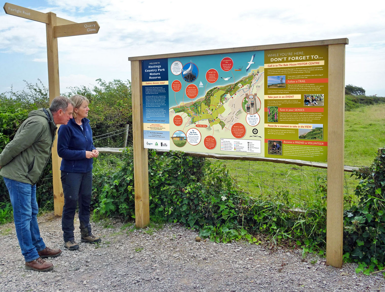
A heads-up map is oriented to match the viewer’s perspective. Instead of fixing north at the top, the map is rotated so that the direction the user is facing appears as “up.”
In practical terms, this means the map mirrors the real world in front of you.
If the café is on your left in reality, it appears on your left on the map. If the route ahead curves right, the map shows it curving right. Users don’t need to mentally rotate anything to make sense of it.
That may sound like a small difference, but in wayfinding, reducing hesitation and confusion can dramatically improve the user experience.
The problem with traditional north-up maps
North-up orientation made perfect sense historically. Early cartography relied heavily on celestial navigation, and standardising maps around north created consistency for explorers, surveyors and printed atlases.
But static wayfinding signage serves a completely different purpose.
When someone stands in front of a sign in a park, town centre, hospital or visitor attraction, they are rarely asking themselves:
“Where is north?”
What they really want to know is:
- Where am I?
- Where do I need to go?
- Which way do I walk?
And this is where traditional north-up mapping can create unnecessary friction.
Studies have repeatedly shown that many adults struggle with map reading and spatial orientation. Some estimates suggest up to 75% of people have trouble interpreting maps to some degree. Presenting a map upside down relative to the viewer only adds another layer of cognitive effort.
Most users instinctively rotate paper maps to match the direction they are facing. Heads-up signage simply removes the need for the mental gymnastics altogether.
Why heads-up maps work so well
The biggest advantage of heads-up mapping is immediacy.
People understand it faster because it reflects how they naturally experience space as a journey unfolding ahead of them, not as an abstract geographical diagram.
In our experience, heads-up orientation offers several key benefits:
Faster understanding
Users can orient themselves almost instantly because the environment in front of them matches the environment on the sign.
Reduced cognitive load
There’s no need to stop and work out which way the map should be rotated. This is especially valuable in busy environments or where visitors are already under pressure.
Better accessibility
Not everyone is confident reading maps. Heads-up orientation makes navigation more inclusive for casual visitors, tourists, families, children and neurodiverse users who may struggle with spatial interpretation.
More natural navigation
Digital navigation has changed expectations. People are now used to smartphone maps that rotate dynamically to match their direction of travel. Static signage that behaves differently can feel unintuitive by comparison.
“But what About multiple directions?”
One of the most common objections to heads-up mapping is this:
“What happens if people approach the sign from different directions?”
The assumption is often that a heads-up map only works for some users. In reality, a properly designed heads-up scheme works for everyone – because each sign is individually oriented to suit its specific location and viewing angle.
That does require more thought during the design process.
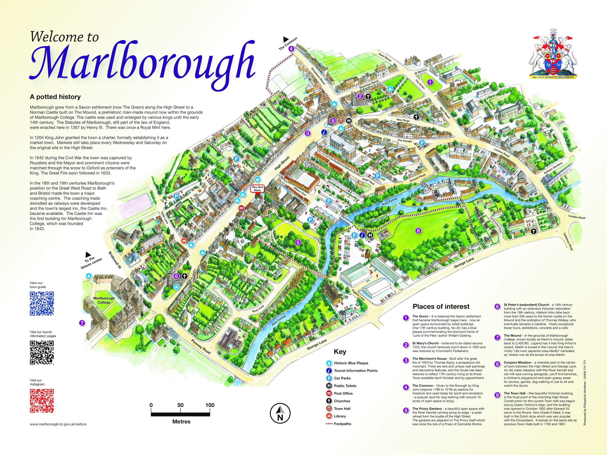
We need to agree the precise sign locations and orientations before artwork begins, because every map is tailored to that viewing position. If the sign location changes later, the map may need redesigning.
But that’s not a weakness of the system, it’s simply part of designing wayfinding properly. Good wayfinding should always be site-specific.
Why north-up persists
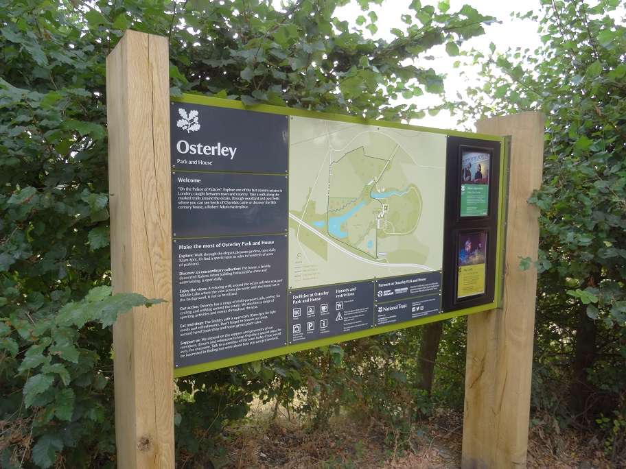
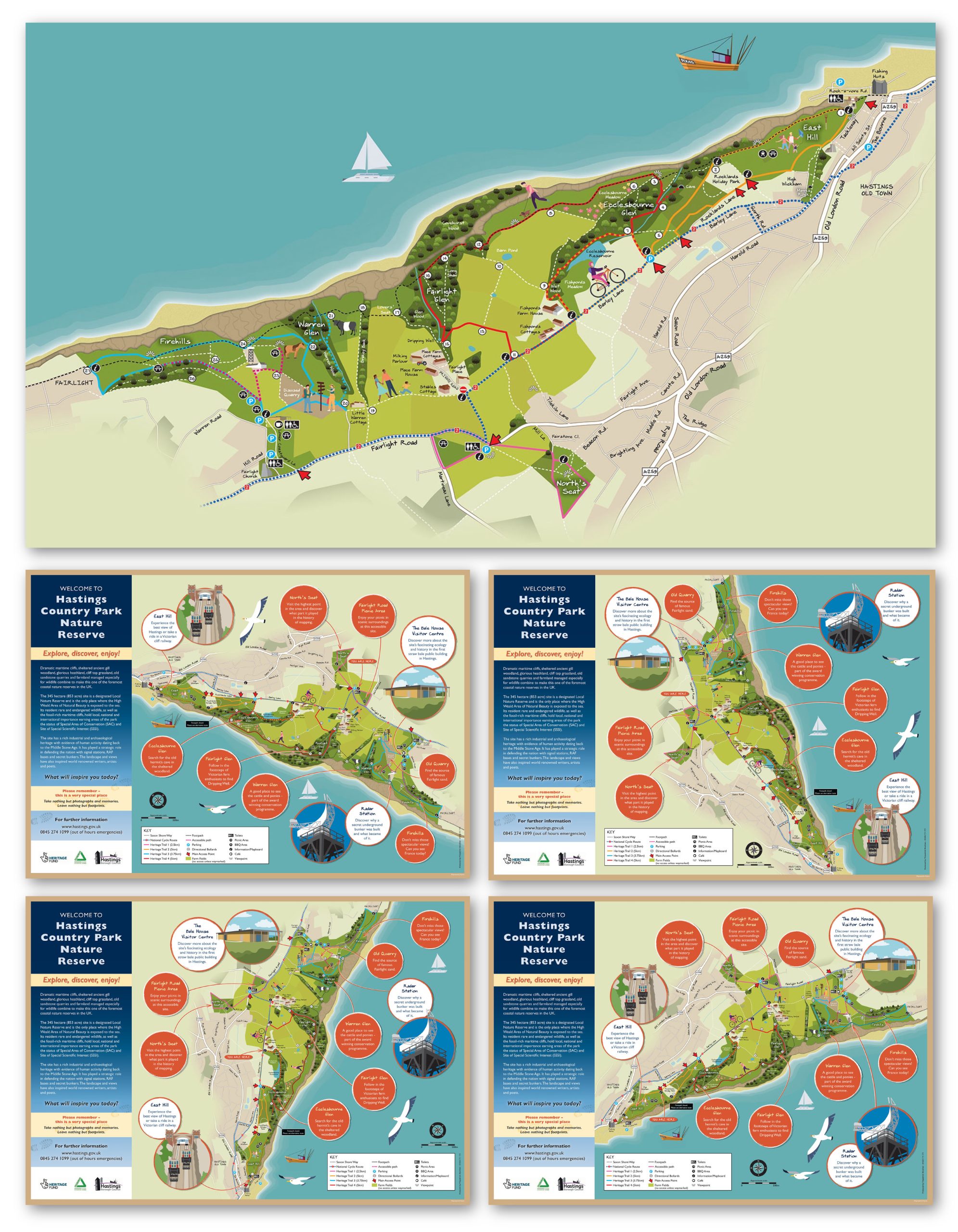
To be fair, north-up maps do still have their place.
They’re useful for:
- Large overview maps
- Printed fold-out maps
- Strategic planning
- Navigation across wider geographical areas
And because north-up mapping has been the industry default for so long, many clients and stakeholders feel reassured by its familiarity.
But familiarity alone shouldn’t dictate good user experience. In fact, I’d argue that insisting on north-up orientation for static public signage often prioritises cartographic convention over real-world usability.
The best solution may be a hybrid one
One approach we increasingly advocate is combining both methods.
For example:
- A local “heads-up” map for immediate navigation
- A smaller north-up inset showing the wider area context
This gives users the instant clarity of heads-up viewing while still providing a broader geographical reference for those who want it.
Done well, it delivers the best of both worlds.
Wayfinding should be designed around people
At its core, wayfinding is not about maps. It’s about confidence.
Good signage reduces stress, removes hesitation and helps people move through spaces comfortably and intuitively. The best systems often go unnoticed because they simply feel obvious.
That means designing around human behaviour rather than historical convention.
If a map is technically accurate but causes people to stop, rotate themselves, argue with companions or walk the wrong way, then it hasn’t fully done its job.
A simple rule we always follow
There’s one principle I believe should apply to every static wayfinding map, regardless of orientation:
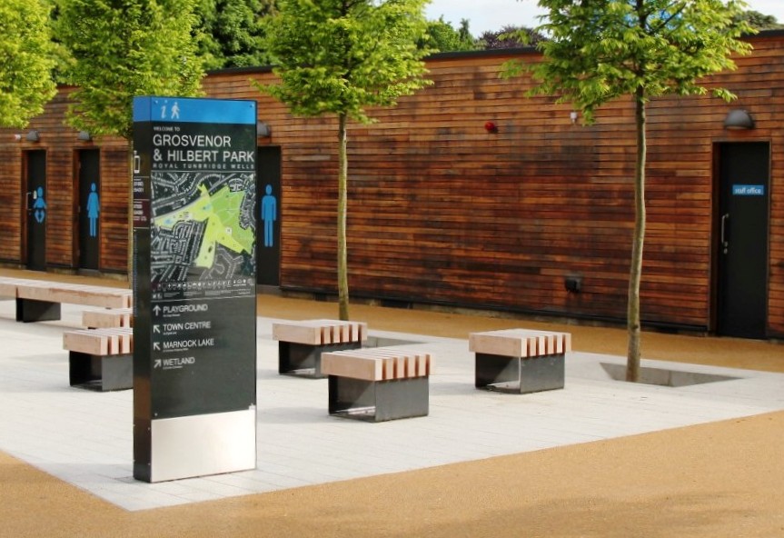
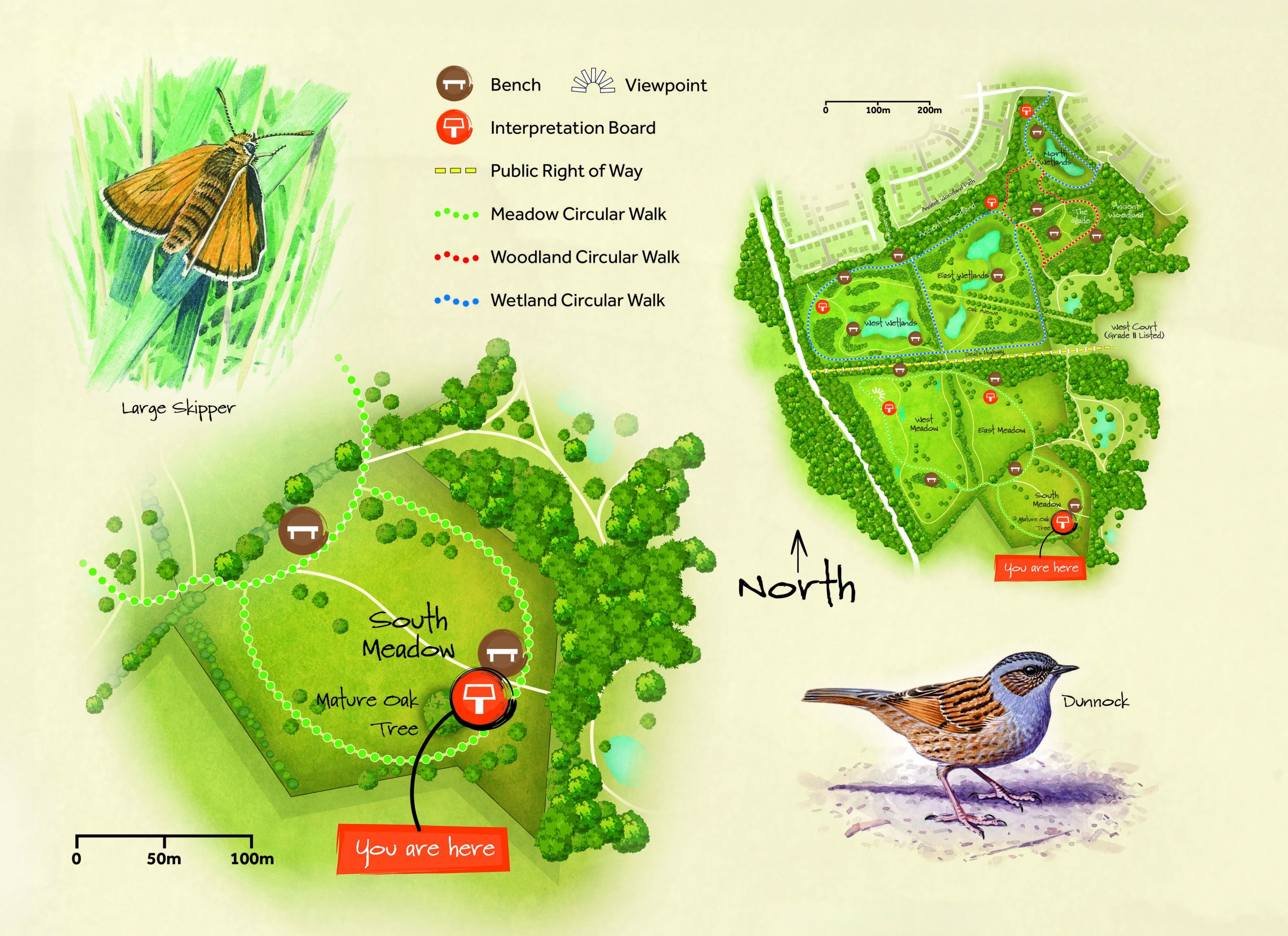
Always include a clear “You Are Here” marker.
It sounds obvious, but it’s astonishing how many maps omit it or make it difficult to spot.
Users can’t work out where to go unless they first understand where they are.
Looking ahead
I don’t believe heads-up mapping should be viewed as experimental or niche anymore. In many environments, it is simply the more intuitive solution.
As wayfinding continues to evolve alongside digital behaviour and user expectations, I suspect we’ll see more organisations moving away from rigid north-up thinking and towards more human-centred navigation design.
For us, that shift has already begun.
The goal of a map shouldn’t be to satisfy cartographic tradition.
It should be to help people find their way as quickly, confidently and effortlessly as possible.