Wayfinding refers to the process of navigation and orientation in an unknown environment, and wayfinding signs are one of the easiest ways to make your outdoor space easy for visitors to explore.
But how can you create a wayfinding system that works? In this blog we’re going to go over five wayfinding principles to keep in mind during the design process, to ensure a simple, effective, and visually pleasing wayfinding system in any space. Let’s get started!
- Effective wayfinding creates clarity through structure and identity: Successful wayfinding systems help people orient themselves by giving each area a clear identity, using consistent design, landmarks and visual cues so visitors always know where they are within a space.
- Good wayfinding guides people naturally, without overwhelming them: Clear paths, well-placed signs and limited navigational choices make environments easier to navigate. The aim is to support intuitive movement rather than force people to stop and interpret complex information.
- Wayfinding should simplify navigation and improve confidence: The best wayfinding systems reduce confusion, improve accessibility and help visitors explore unfamiliar environments comfortably by balancing clear direction with simple, visually recognisable design.
5 Wayfinding Navigation Principles To Consider
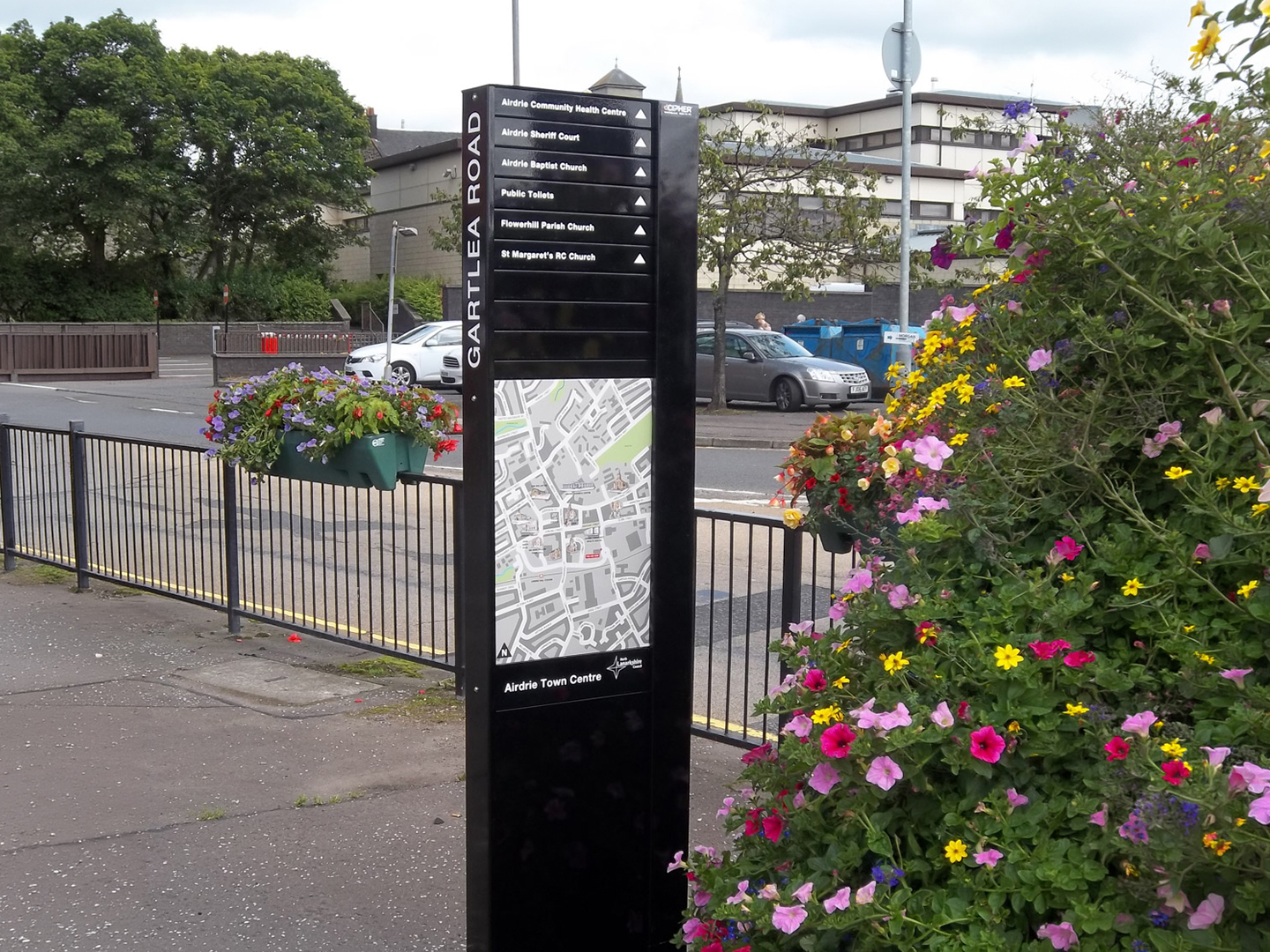
1. Create an identity at each location
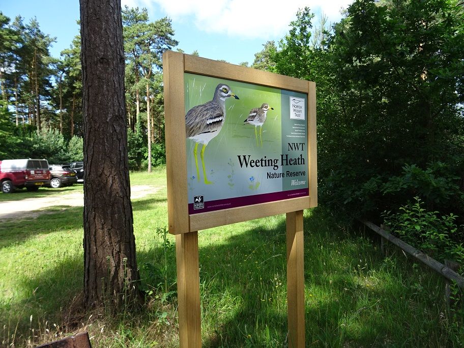
When it comes to wayfinding, a key consideration to remember is that every location should have its own look and feel. This will help to create an identity for the space, making it easier for visitors to recognise the area and be able to navigate it more easily.
To do this, signage should be designed in a way that is distinctive from neighbouring places. Consider using colour palettes specific to each area and unique typography, while still being consistent with the overall design style of the entire site or building. For example, if you are designing signs for a shopping centre, use colours that match the branding of each individual store; if you are designing directional signs for a hospital, use colours and typography that match the overall aesthetic of the building, and are simple to read.
Another way to create an identity for each location is to use landmarks as markers or reference points. Consider adding images of local attractions or iconic buildings in order to draw attention to the space and provide a memorable visual cue. This will make it easier for visitors to recognise each area they enter, giving them a sense of familiarity with the surroundings which can help them orient themselves more easily.
2. Use landmarks to provide orientation cues
Landmarks should also be used to provide orientation cues, allowing users to immediately identify their location within any given space. This helps people understand where they are in relation to other areas, making it easier for them to determine which direction they need to go.
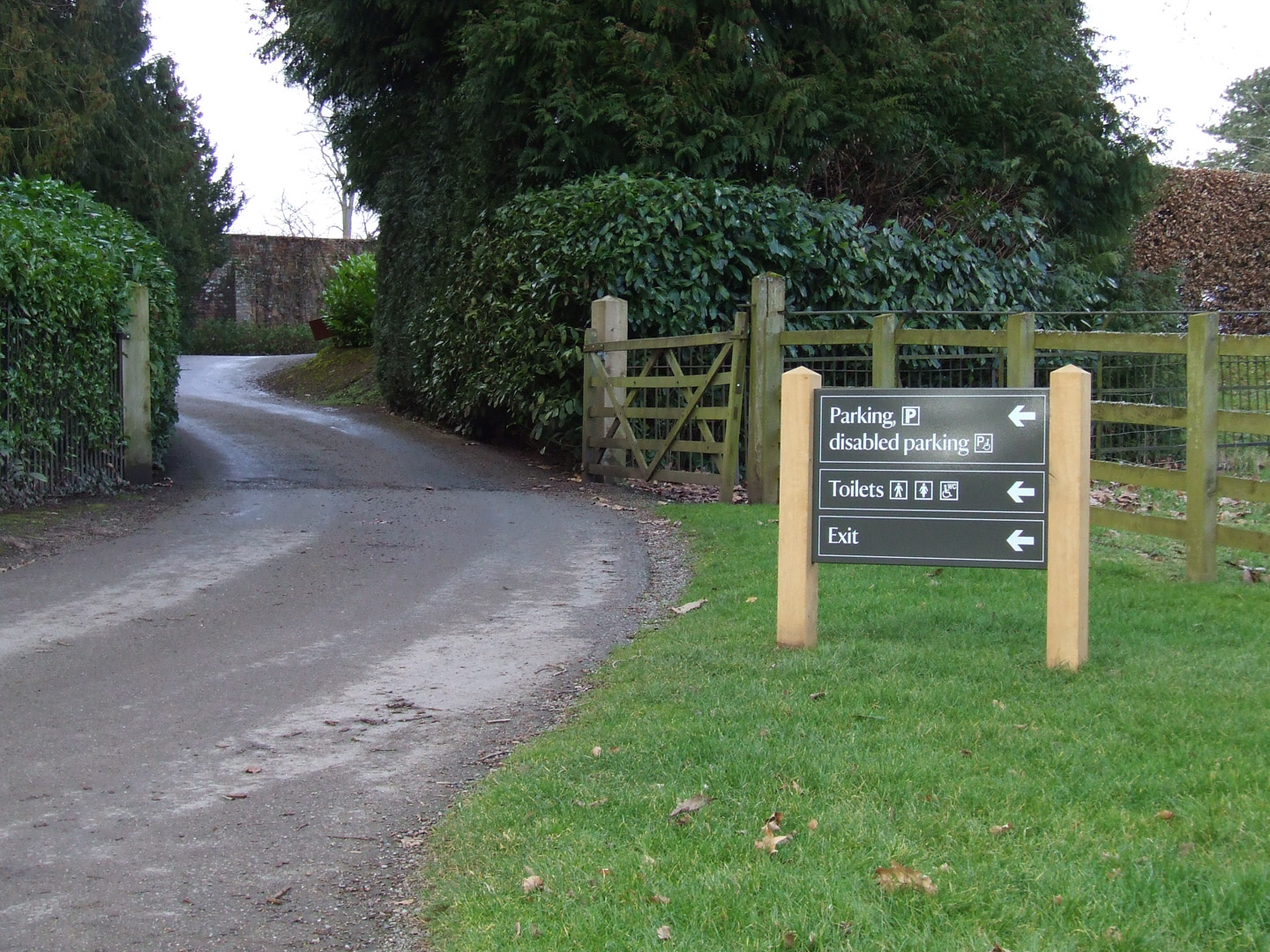
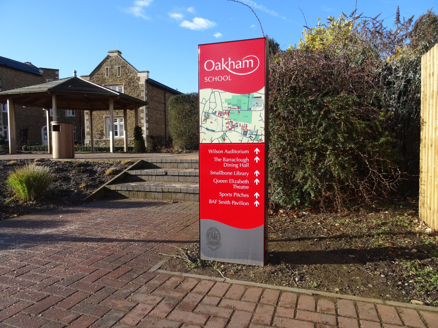
In locations where landmarks can’t be used as orientation cues, signs should be provided that indicate the various directions visitors may take. For example, directional arrows pointing towards different amenities within the area or a simple map displaying the key points of interest within a building. This helps to provide visitors with easy-to-understand navigation options and clearly define their current location and intended destination.
You can also use helpful signs that describe sights or attractions that people may not be familiar with. This could include short descriptions of nearby monuments or historical markers, providing more information about the surrounding area and giving visitors a more comprehensive understanding of their location.
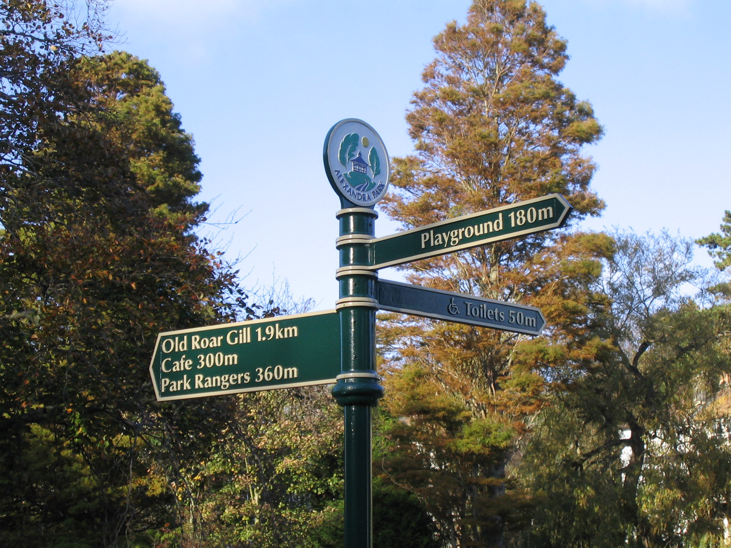
3. Create well-structured paths
When it comes to wayfinding, it is important to create paths that are easy for users to follow. This means ensuring there is a clear flow between each different area, and making sure each route has the right amount of signposts and markers so people can easily orientate themselves without getting lost.
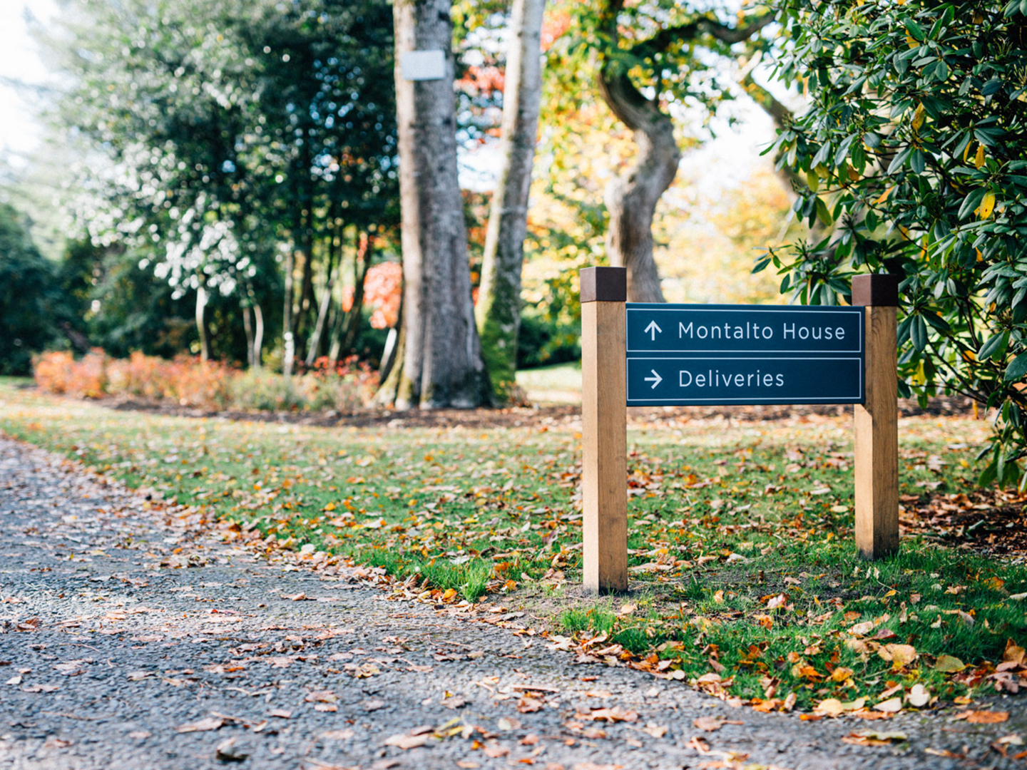
One way to create well-structured paths is to clearly mark the route from one area to another, for example, by providing arrows or lines to indicate the direction people should go. Another way is to design signposts that are large enough and visible enough for users to be able to see them easily, while also having a clear indication of where they lead. For example, if there are two entrances into a building, one could have an arrow pointing left and the other right with the destination written beneath each arrow.
Finally, you can use colour-coding or differentiating shapes to make it easier for visitors to identify their current location in relation to other areas within a space. This could involve creating signposts in different colours for each area or using circles for one route and squares for another; this will help people understand which path they should take more easily.
4. Create regions of differing visual character
To create a cohesive sign system, it is important to consider how different areas within a location relate to each other; this will help give visitors a sense of place and understanding of their overall environment.
To do this, try to create distinct regions within the space with varying visual characteristics — this could include specific colour palettes, fonts or graphics used on signs in particular areas. Play on regional characteristics where possible; for example, signs could include images of local attractions or iconic buildings in order to draw attention to the space and provide a memorable visual cue.
Also consider how your signs communicate with each other; think about which elements should be consistent throughout a whole area and what should change from one region to another – this will help create a more dynamic sign environment that is visually stimulating for users and easier for them to navigate.
5. Don’t give users too many navigational choices
It is important to remember not to provide users with too many navigational choices when it comes to wayfinding. This can lead to confusion, making it harder for visitors to find their way around. Instead, focus on providing clear directions and reducing complexity within your sign system so visitors can easily orientate themselves without getting overwhelmed by information.
The key here is balance — too few signs will leave users confused as to which direction they need to go; conversely, too many signs may overwhelm them and make navigation difficult.
Wayfinding Signs should be placed at regular intervals along the path with enough details for people to understand where they are going, but not so much information that it becomes overwhelming.
Think about how different paths intersect and provide clear points of reference that indicate the direction visitors need to go; you can also make use of colour coding or simple symbols to help identify each route, making it easier for users to understand which way they should be travelling.
Key takeaways
One of the most important takeaways to retain from this blog is the following: wayfinding systems should simplify the navigation process, not complicate it. By adhering to these 5 principles, you’ll be able to design an effective and efficient sign system that encourages and helps visitors to explore your space, without feeling overwhelmed by information.
Frequently Asked Questions
Why are wayfinding principles important?
Wayfinding principles ensure navigation feels intuitive rather than confusing. When applied correctly, they reduce stress, improve accessibility and help people move confidently through a space.
How many wayfinding principles are there?
There is no fixed number, but most effective wayfinding systems are built around a small set of core principles, such as creating clear identities, using landmarks, defining paths, differentiating regions and limiting navigational choices.
What does “creating an identity for each location” mean in wayfinding?
It means giving different areas their own recognisable visual character using colour, typography or imagery. This helps people recognise where they are and remember locations more easily.
Why are landmarks important in wayfinding?
Landmarks act as reference points that help people orient themselves. They allow visitors to understand their position within a wider space and make navigation more memorable.
How do structured paths improve wayfinding?
Clear, well-defined paths guide people naturally from one place to another. When routes are easy to follow and supported by signage at key points, visitors are less likely to get lost or confused.
What does “creating regions of visual character” involve?
This involves grouping areas into zones with shared visual elements, such as colours or symbols. It helps visitors understand how different parts of a space relate to each other.
Why should navigational choices be limited?
Too many options can overwhelm users and slow decision-making. Limiting choices makes navigation simpler and helps people move through a space with confidence.