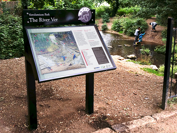
Colour choices can make a big difference to the effectiveness of your wayfinding systems, from using recognised colours to communicate safety information to introducing colour coding that helps visitors navigate different areas of a building or attraction.
Great wayfinding should be easy to interpret, accessible to a wide range of visitors and convey important information clearly and concisely. Thoughtful signage design helps people navigate confidently, find facilities and enjoy their surroundings without unnecessary confusion.
The Fitzpatrick Woolmer team explores how colour, contrast and consistency can improve wayfinding and enhance the visitor experience.
Why are colour choices important for Wayfinding signage design?
We encounter signs every day that use colour to communicate information or reinforce important messages. Traffic lights are a familiar example, with red meaning stop, amber indicating that drivers should stop unless it is unsafe to do so, and green allowing traffic to proceed when safe.
Safety signage follows established conventions, with red commonly indicating prohibition, yellow or amber warning of hazards, and green identifying safe conditions or emergency escape routes.
Blue is another familiar colour in UK signage, commonly associated with mandatory instructions and certain transport and route information.
However, colour alone doesn’t guarantee that a sign will be noticed or understood. Effective wayfinding combines appropriate colours with clear lettering, recognisable symbols and sufficient contrast to make information easy to identify and interpret.
For example, a restricted-access sign should communicate its purpose clearly through appropriate wording and, where required, recognised prohibition symbols rather than relying solely on a red background to suggest danger.
Using colours in on-brand Wayfinding signage
Businesses and visitor attractions often prefer colours that reflect their brand identity, helping create a cohesive, professional environment and a consistent visitor experience.
However, brand colours must also work effectively in practice. A colour scheme that looks attractive in promotional materials may not provide sufficient contrast or legibility when applied to signage.
Consider how easily children, non-English-speaking visitors and people with visual impairments can interpret the information displayed.
Colour choices should also complement their surroundings. In heritage settings and natural landscapes, carefully selected tones can help signage sit comfortably within its environment without becoming difficult to locate or read.
Rather than relying on a colour wheel to select attractive combinations, designers should consider the difference in lightness between colours, ensuring that lettering and symbols remain clearly distinguishable from their backgrounds.
How to develop high-visibility Wayfinding signage
Contrast is essential to effective wayfinding, helping visitors distinguish lettering, symbols and directional information from the sign’s background.
Dark lettering against a light background, or white lettering against a sufficiently dark background, can provide excellent legibility. However, the effectiveness of any combination depends on the colours selected and the conditions in which the sign will be viewed.
Typeface, letter size, viewing distance and positioning are equally important. Larger lettering can improve readability from a distance but cannot compensate for inadequate colour contrast.
Outdoor signage introduces further considerations, including changing daylight, shadows, reflections and glare. Testing colour combinations under realistic viewing conditions helps ensure signs remain legible throughout the day and across different seasons.
Ultimately, the aim is not simply to make signs stand out, but to ensure visitors can locate and understand the information they need.
Incorporating colour coding into Wayfinding
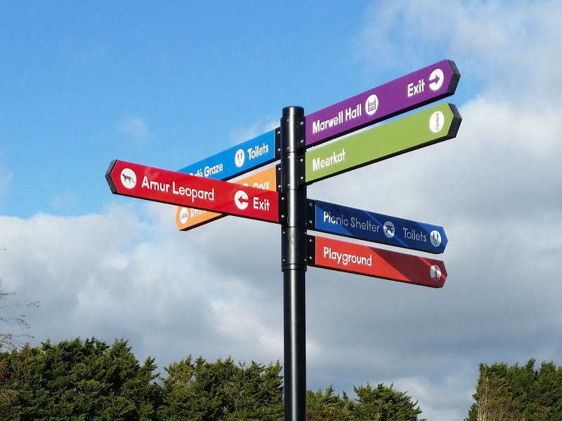
Colour coding can simplify navigation by helping visitors identify particular destinations, facilities or routes without repeatedly reading detailed instructions.
Airports, visitor attractions, hospitals and nature trails commonly use colour to distinguish different areas or routes, creating a consistent visual system that visitors can recognise and follow.
For example, a visitor attraction might assign different colours to exhibition areas, while a country park could use coloured markers to distinguish walking routes.
However, route identification should not be confused with difficulty grading, where colours may have specific meanings within an established system.
Consistency is essential. Once a colour has been assigned to a destination or route, it should be applied throughout the visitor journey, including maps, directional signs and confirmation markers.
Using a limited, carefully considered palette also helps avoid confusion. Too many colours, or inconsistent applications, can make navigation more complicated rather than easier.
Importantly, colour coding should be supported by destination names, symbols or route numbers so visitors aren’t dependent on colour recognition alone.



Choosing the right colours for your Wayfinding system
The most appropriate colours will depend on your site’s character, surrounding environment, visitor needs and any relevant safety requirements.
A successful wayfinding system should balance visual appeal with clarity, accessibility and ease of navigation.
Colour vision deficiency is an important consideration, particularly where visitors may struggle to distinguish combinations such as red and green. Using clearly differentiated tones alongside text, symbols or numbers ensures information remains understandable without relying solely on colour.
Sign placement and materials also influence colour choices. For example, floor-based wayfinding may experience considerable wear, while outdoor signs must retain their legibility despite weathering, changing light and exposure to the elements.
By considering these factors from the outset, you can create a consistent and intuitive wayfinding system that complements its surroundings while helping visitors navigate confidently.
For more information about choosing colours for your wayfinding or incorporating your brand identity into high-quality signage, please get in touch. Our experienced signage consultants offer a comprehensive design service, providing recommendations tailored to your site, visitors and objectives.